
Avira is an internet security solution company that provides antivirus softwares for desktop and mobile platforms. The company offers free and subscription-based softwares from its website and the download rate has been one of the key metric to measure company success. When the data analytics revealed that nearly 65% of the users failed to download the free software, the team was eager to solve this issue with a new content strategy and web redesign to improve download rate and better customer engagement.
The Missing Piece
Design team kicked off this project by first collecting more in-depth data to verify the reason why the website was underperforming with usability study. During these studies, we've learned that many users had difficulties on choosing the suitable products based on their needs. The participants stated that it was frustrating and they did not have the patience when they found themselves struggled to consume the related product information and wished there are guides to simplify the experience.
Lack of helps and guidances were the obvious customer pain points but there was one more factor that was beyond the tangible evidences, and that was the lack of customer engagement, I called the "emotional bond." Based on my observation, the content of the website didn't mentally connect with our users. When someone is worried about his computer would be under the attack of viruses or malicious contents, the website needs to provide solutions but simultaneously, creates a soothing and worry-free experience to gain users' trusts. That is why the emotional bond is essential.
This is the high level wireframes of the homepage and product page redesign.
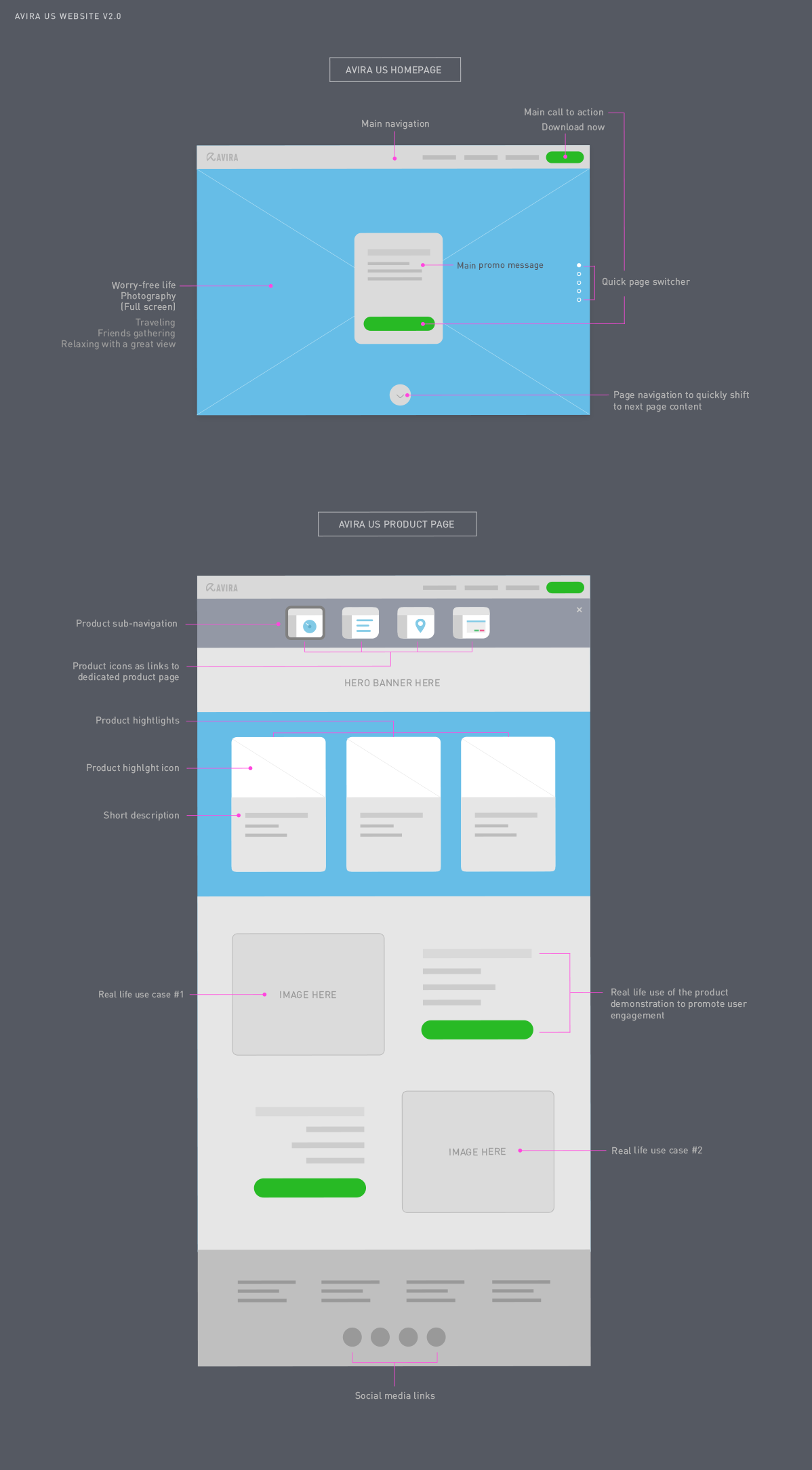
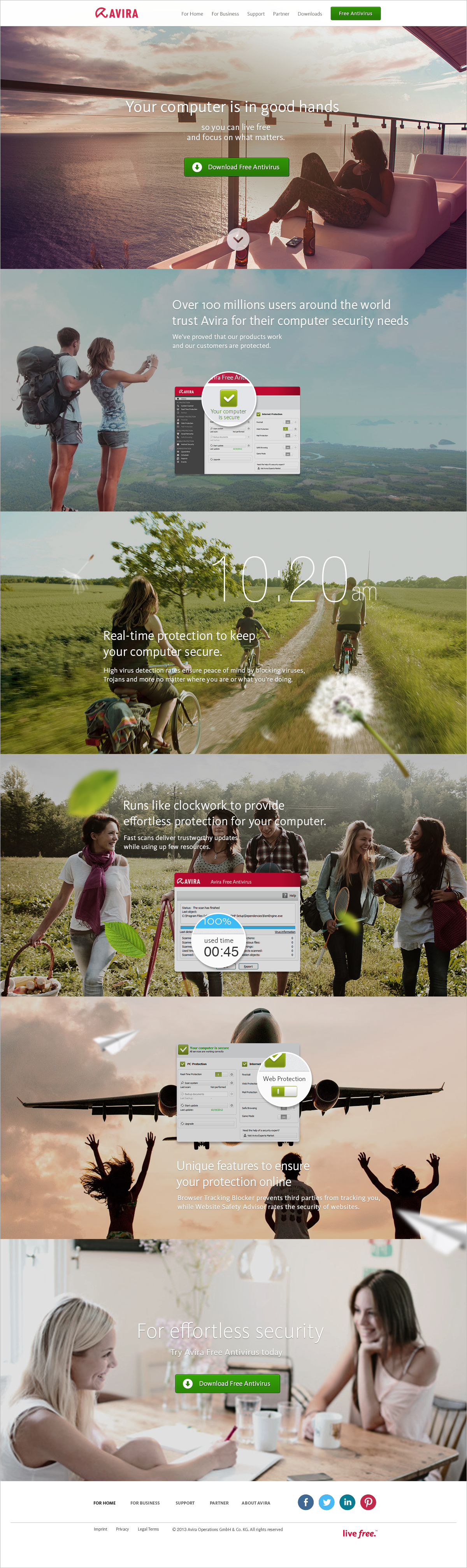
Homepage redesign
With a series of lighthearted lifestyle photography, users see and feel the security by immersing themselves through the different courses of life events with a parallaxing scrolling experience. In each frame, a core feature is highlighted along with an intuitive app interface. The interfaces provide a quick preview of the app and with the main CTA button always being visible from the top navigation, user is now able to download the free antivirus app regardless of where they are from the website.
Avira's product family icon set
To help users better understand all the different Avira products, I created an icon set using simple illustrations. These icons highlighted the unique purposes of each product and they were positioned in the product navigation that brought a tighter connection with the users when they are choosing each product sub-category.
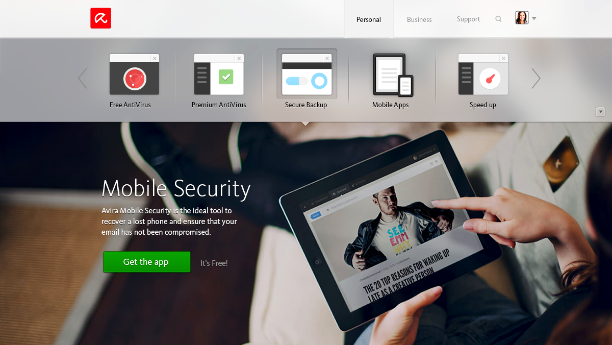
TOP - Product navigation icons
BOTTOM - Product feature card icons

Product selection menu
The screen capture below highlights how the product icons are used within the product page. Each product icon servers as a button and the corresponding banner with individual product description is presented when the product is selected.