The backstory
When I first joined the XenMobile product design team in 2014, the team had recently unveiled the latest app redesign for its flagship email client WorxMail, (the predecessor of Secure Mail). The freshly branded WorxMail had the iconic purple color along with multiple shades of grey as the secondary color in the overall scheme. The large, bold font style and crisp iconography were also the key differentiators that made WorxMail stand out among the competitors. As WorxMail underwent several strategical changes and was eventually given a new name, it was the perfect opportunity to introduce a revolutionary visual facelift to the new Secure Mail.
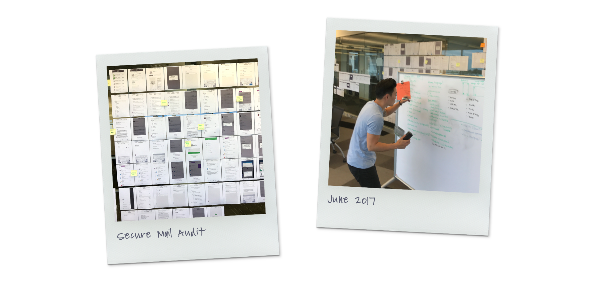
The plan started with a deep dive on top of all the existing screens and executed an app-wide audit. The audit contained both UX and UI items that could be improved based on a user study, customer feedback, and my own assessment. For this UI redesign project, I categorized the efforts into 3 major buckets:
1. Reassign a new brand color
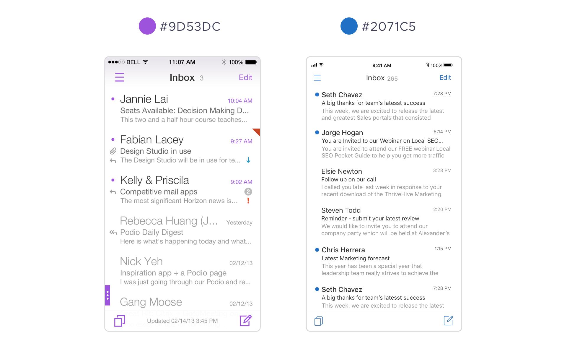
Many customers have voiced their feedback regarding the existing purple didn’t feel “enterprisey”. Customers either love the purple because it was unique or disliked it because it did not resonate well with the conventional business standard. The design team collaborated with the brand team to come up with a new blue hue that associates well with Citrix's corporate identity. Here is the Before and After comparison of how the Inbox looks after the color update.
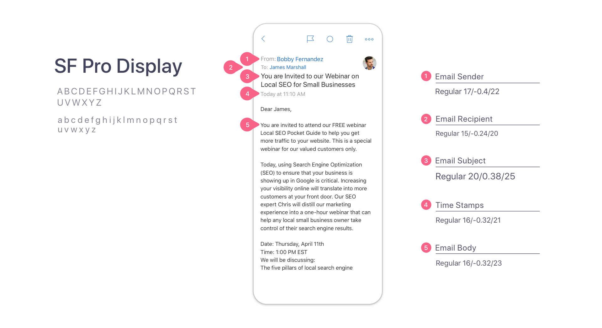
2. Adapt native iOS system font
To better align with the native experience, we updated the font from the existing Helvetica to the iOS system font SF Pro. Adapting the native system font ensures font rendering optimization for multiple iOS devices and also provides tighter integration with text elements when it comes to iOS accessibility settings
3. Modernize icon set
Secure Mail icons are mainly classified into two groups, File type icons, and Action icons. The legacy icons had 2px stroke thickness and straight corner radius which looked bold and rigid. To supply a more modern and trendier visual style, I reduced stroke thickness and curved those 90-degree corners. The overall objective was to provide a friendlier and more approachable interface by simplifying as many details as possible to bring elegance.
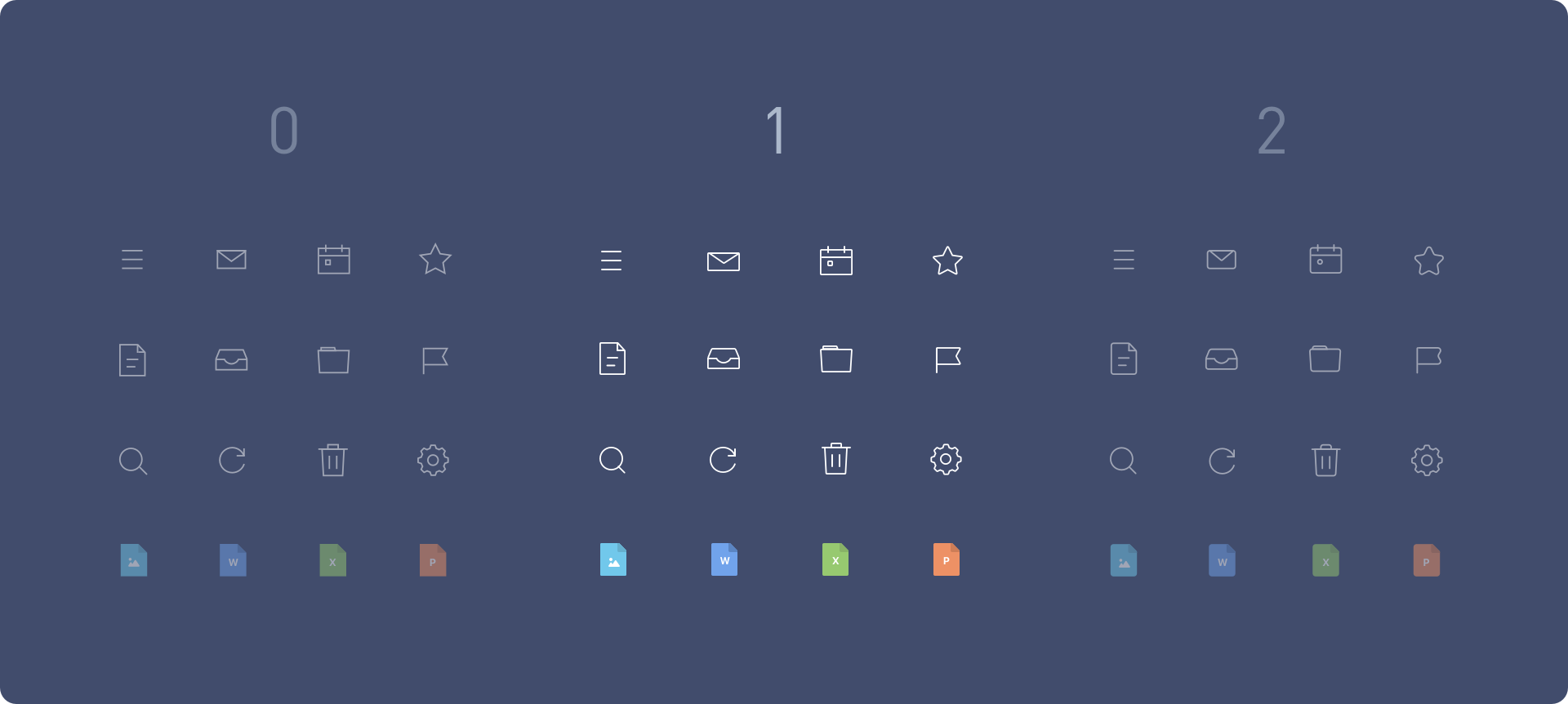
Besides stroke thickness, corner radius was another visual element I finessed. I applied 3 different corner radius settings to a group of commonly used Secure Mail icons, in order to compare the visual differences among different settings. Corner radius 0 looked dull without any notable characters, while edges from corner radius 2 started revealing too much curve and roundness. Corner radius 1 was clearly the perfect balance that possesses both modern aesthetics while maintaining a professional edge.
Corner radius comparison between 0, 1 & 2.
Secure Mail icon baseline design principles:
+ All icons are reduced to minimal forms. Avoid using intricate shapes.
+ All icons are stylized with solid outlines. Filled icons are only used for selected states.
+ Outline is always 1-pixel stroke thickness. Never use stroke thicknesses of more than 1 pixel.
+ Apply a 1-pixel corner radius to all corners. Use rounded tips on all open line ends.
+ Always use a straight-ahead perspective if possible. Avoid tilted icons with angles.
+ All lines should be connected without opening, if possible.
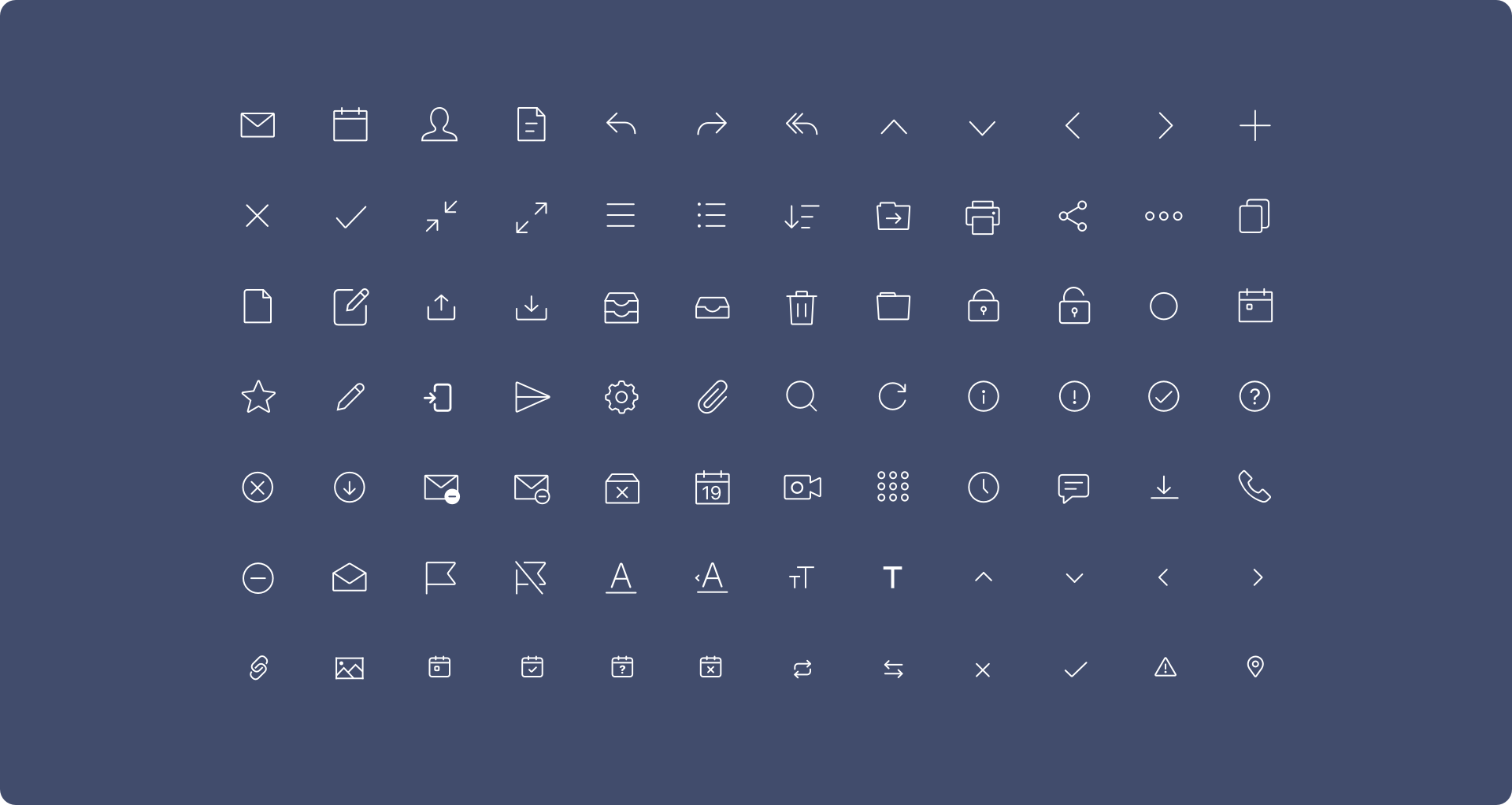
Action icon set
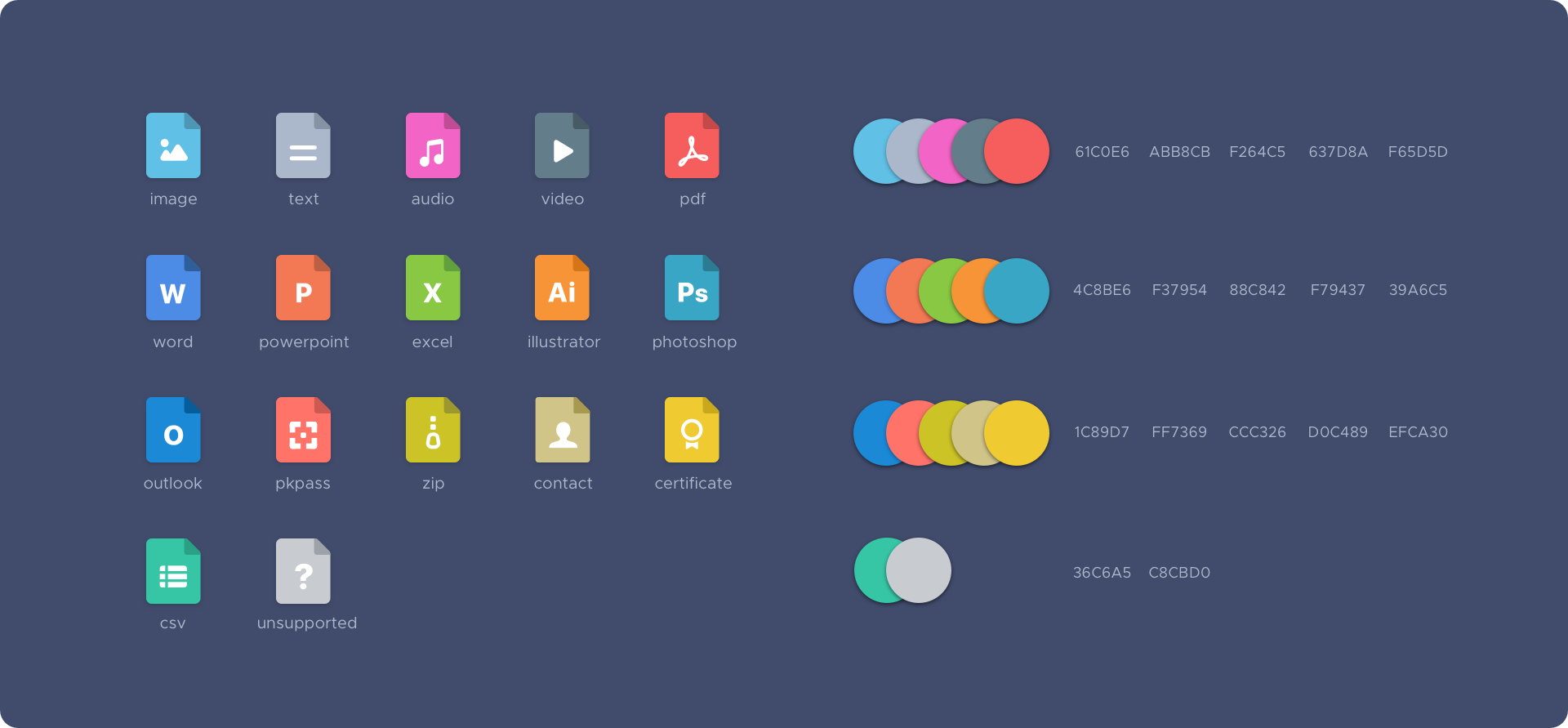
File type icons
After the Action icon set was completed, I inherited the same core design DNAs (minimalistic graphics & subtly rounded corners) and applied them through File type icons to maintain a coherent consistency. I retained the conventional colors that resonated well with each file format but slightly nudged these hues for a more updated, fresh look. These 17 different file icons often appear in arbitrary combinations, hence choosing multiple colors that are individually unique but also complement each other is fun, a yet challenging task to do.
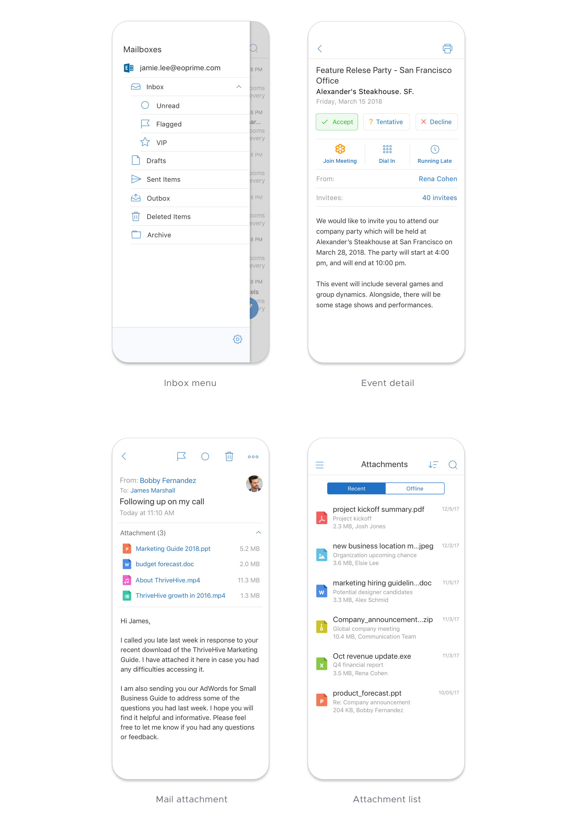
Core app screens after redesign