
Background
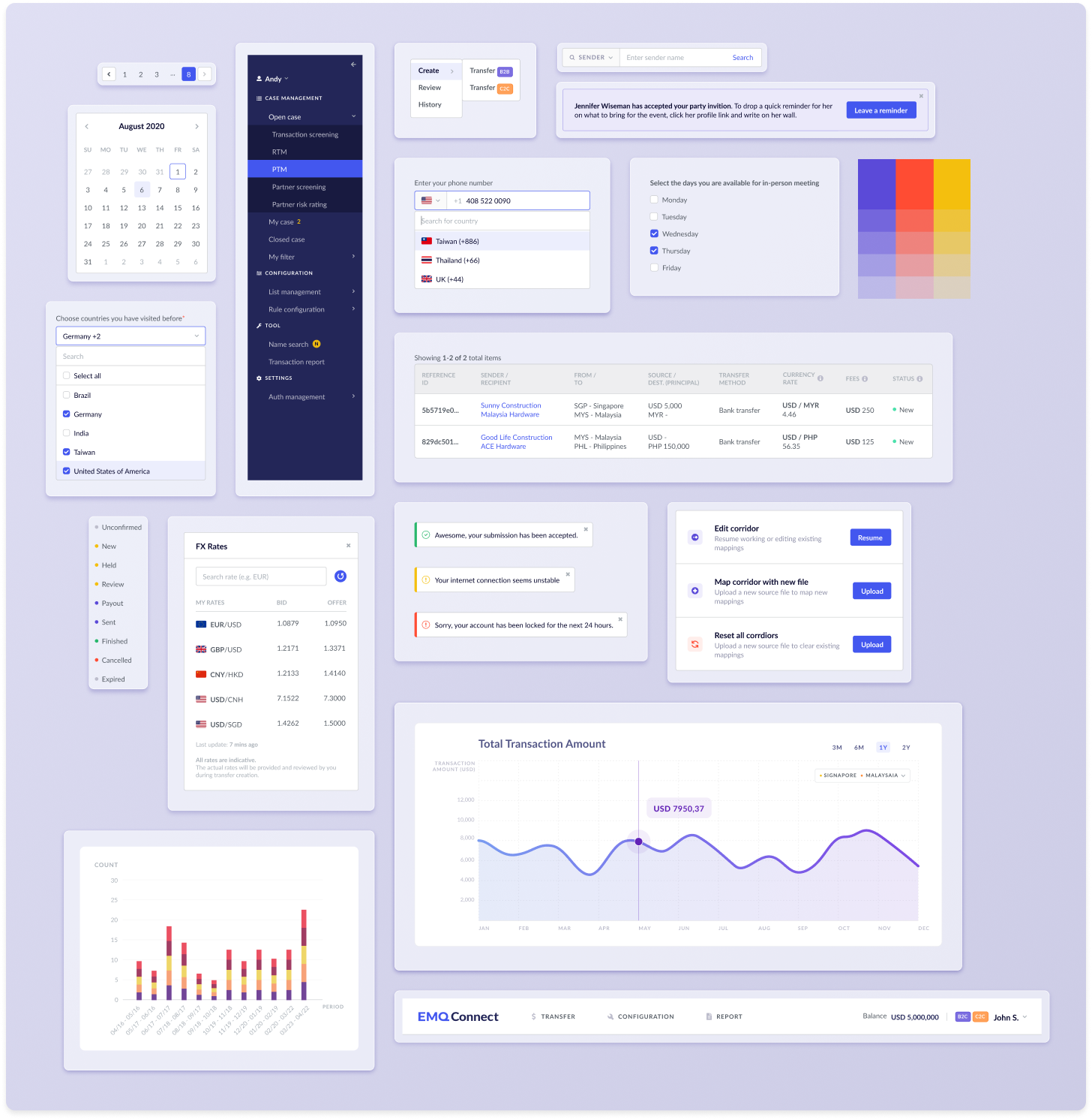
Before joining EMQ, the company had one primary product: the EMQ Core Admin tool. This tool serves as an internal system for managing daily operations and configuring various business logic behind the scenes. However, the Engineering team initially developed the product in its early phase with limited consideration given to UX/UI, leaving plenty of room for design improvements.
As the business of EMQ begins to scale, I was brought on board to lead UX/UI for a new anti-money laundering product. This presents the perfect opportunity to push for a formal design system that not only benefits the existing Core Admin tool but also future EMQ products. I am eager to create a design system that establishes a single source of truth for aesthetics and interaction patterns, which the company lacks. Having a design system enables EMQ to achieve product consistency and save resources for both the engineering and design teams.
Build from scratch
Numerous open-source frameworks with intuitive usability and beautiful interfaces are available for quick "plug-and-play" app development. However, these frameworks could compromise the brand identity and functionality of products, as customization of the existing design often requires hours of rewriting code. Furthermore, without any customization, the outcome could look identical to millions of other websites using the same framework. After deliberation with the engineering manager, I made the decision to build the EMQ Design System from scratch.
Before diving into the design process, I researched several popular design systems, including Semantic UI, Ant Design, Bootstrap, and IBM Carbon Design System. Through this research, I compared the overall system structure, variety of components, and detailed interactions among all four systems. These learnings have inspired me to consider the complexity of EMQ components in various settings and use cases during the early design phase.

Turn thoughts into visualizations
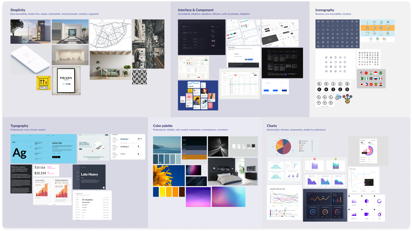
As a Fintech service provider, EMQ's corporate identity must convey a sense of professionalism, efficiency, reliability, and adaptability. To effectively visualize these qualities, I created a mood board that organized my visual references into distinct categories: Simplicity, Interface & Component, Typography, Color Palette, and Iconography.
Using this mood board, I was able to articulate my design directions to my fellow designers and the product manager, and gather valuable feedback for iterations and refinement.
Define components
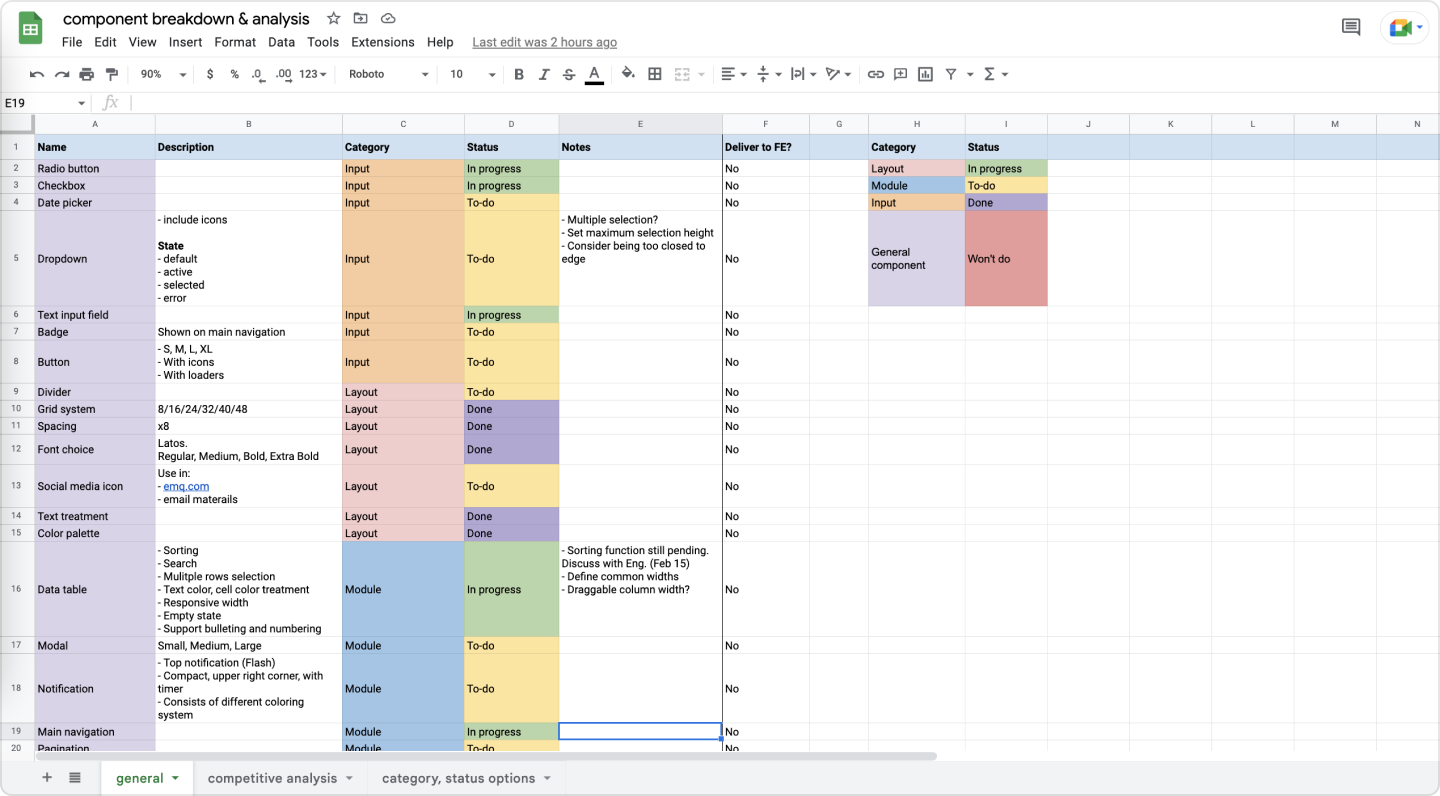
To gain an understanding of the standard and custom components required for EMQ products, I conducted an analysis of the key functions in the EMQ CORE Admin tool. To capture my findings, I used a Google spreadsheet, which allowed me to organize the data clearly and assign meaningful color codings and progress statuses to each item on the list. The colors were used to indicate the group each component belongs to, and with the labels of To-do, In progress, and Done, I could easily track progress and effectively communicate my design status with the product manager and engineers.
Design system by categories
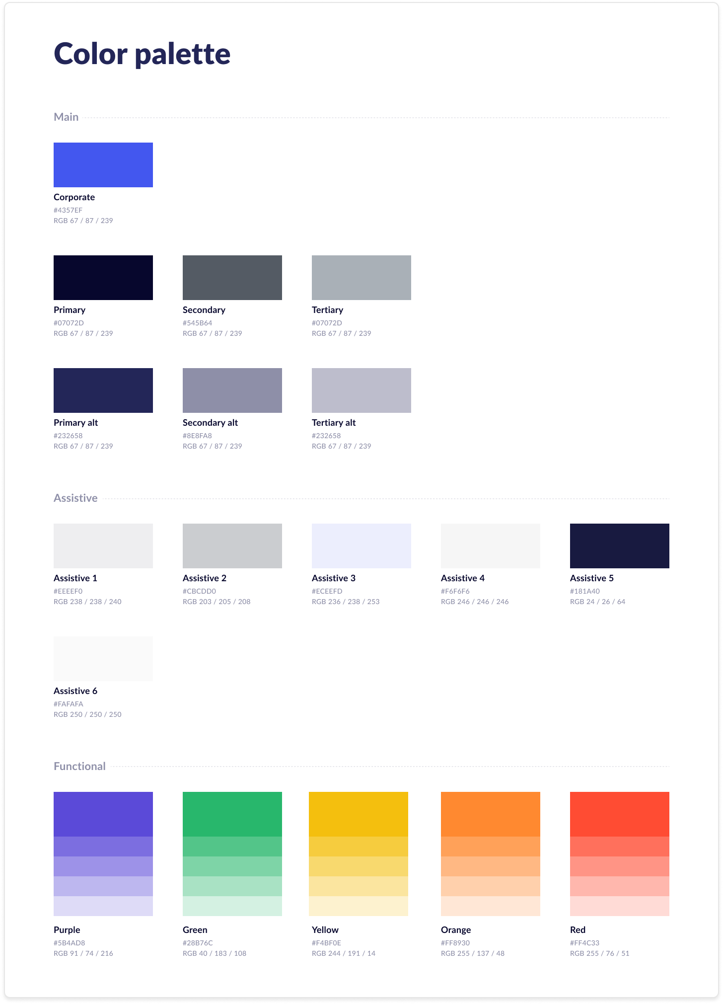
A design system is typically organized into various categories of guidelines to simplify communication with designers and developers. For EMQ Design System, I created three guidelines: Layout, Component, and Visualization. Layout elements are the building blocks that form and manipulate the overarching UI, while modularized elements are categorized under Component. Analytical charts and graphs belong to the Visualization category. Here's a brief overview of each key element within these guidelines:
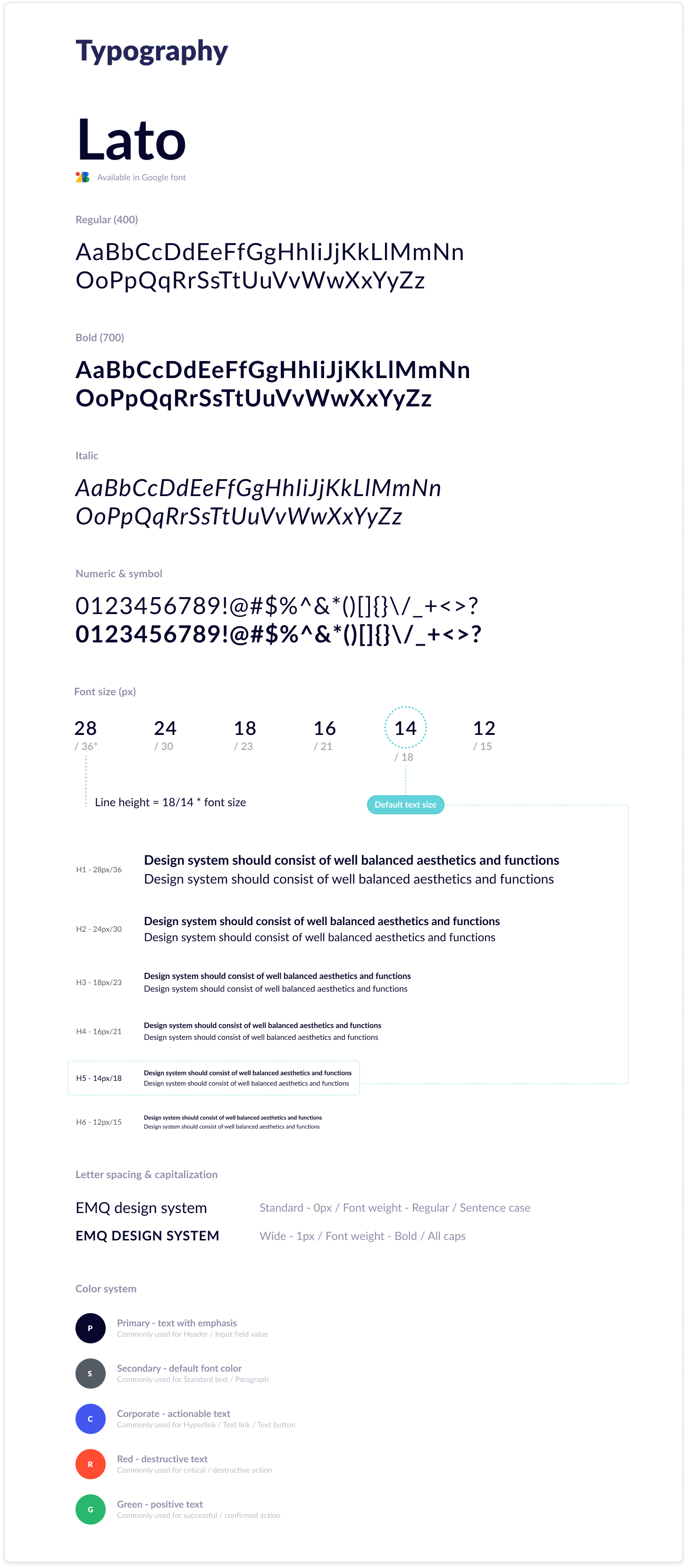
+ Layout: Color palette, typography, icons, grid system, spacing, theme...
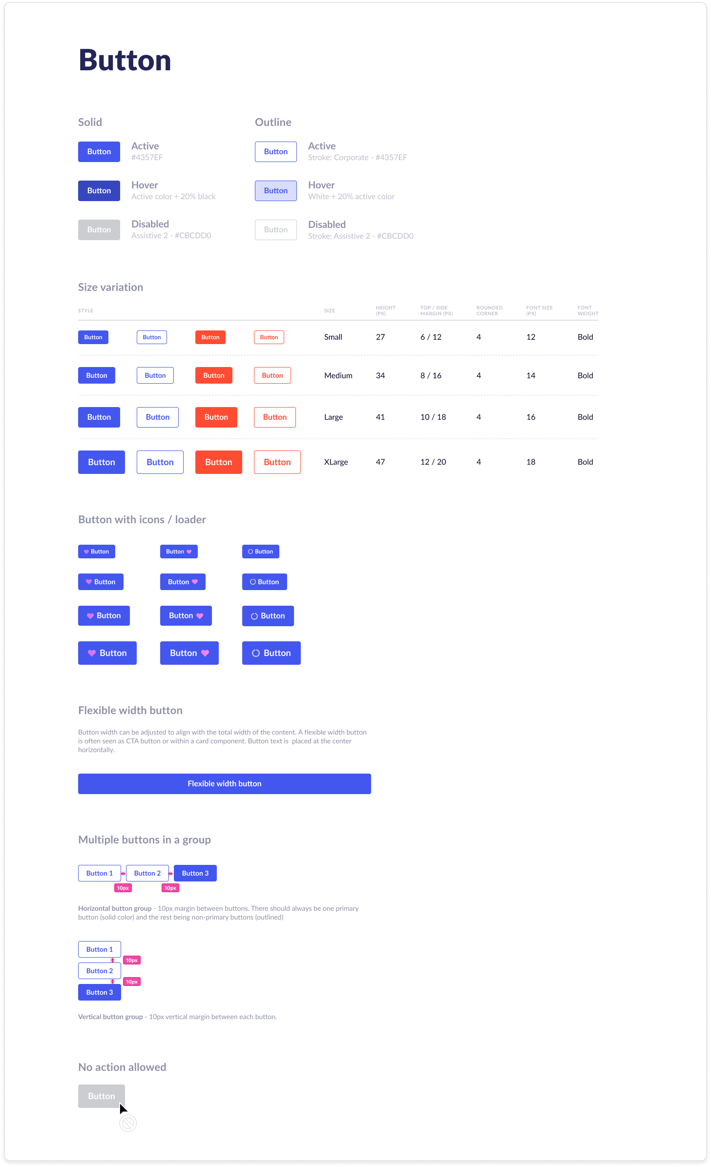
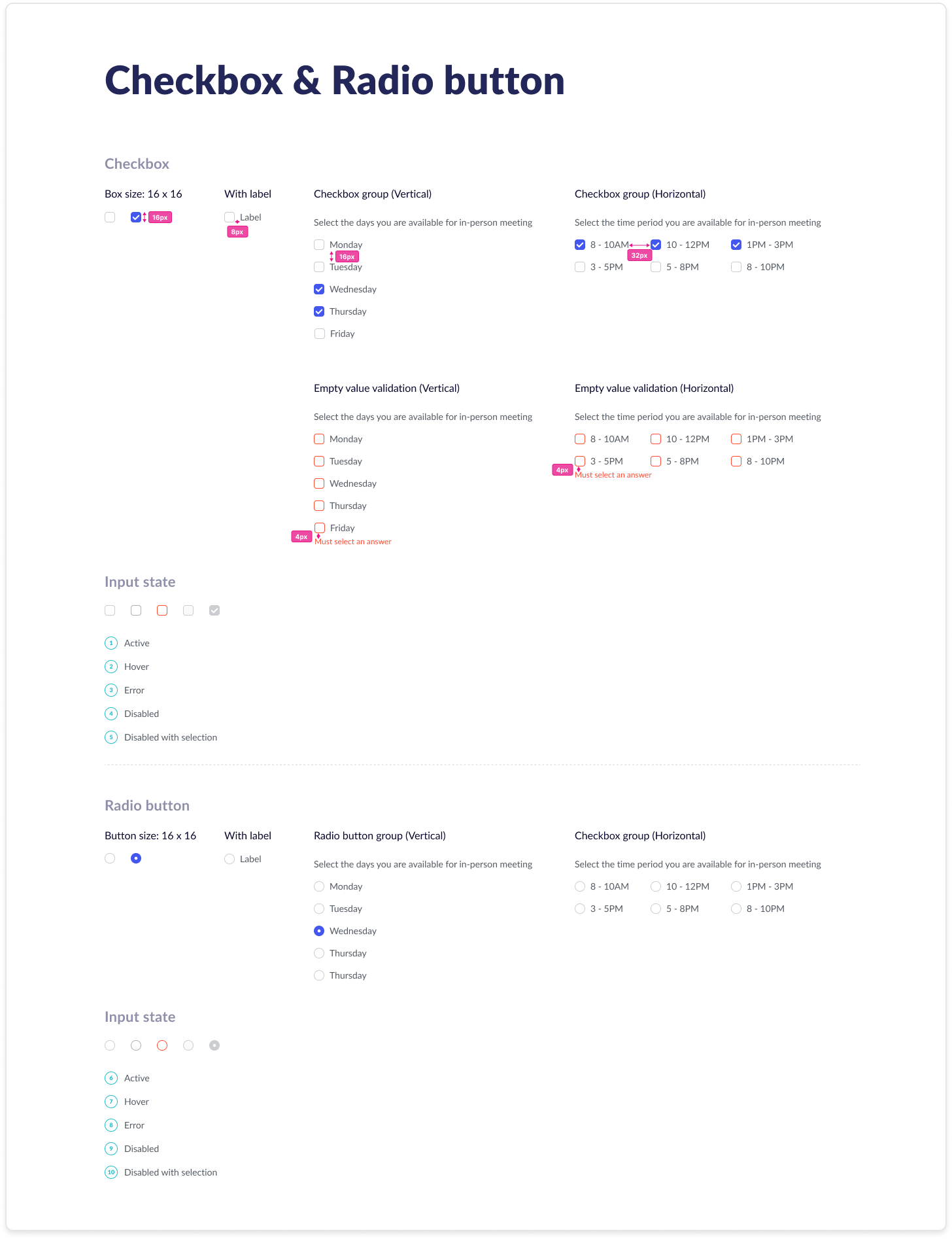
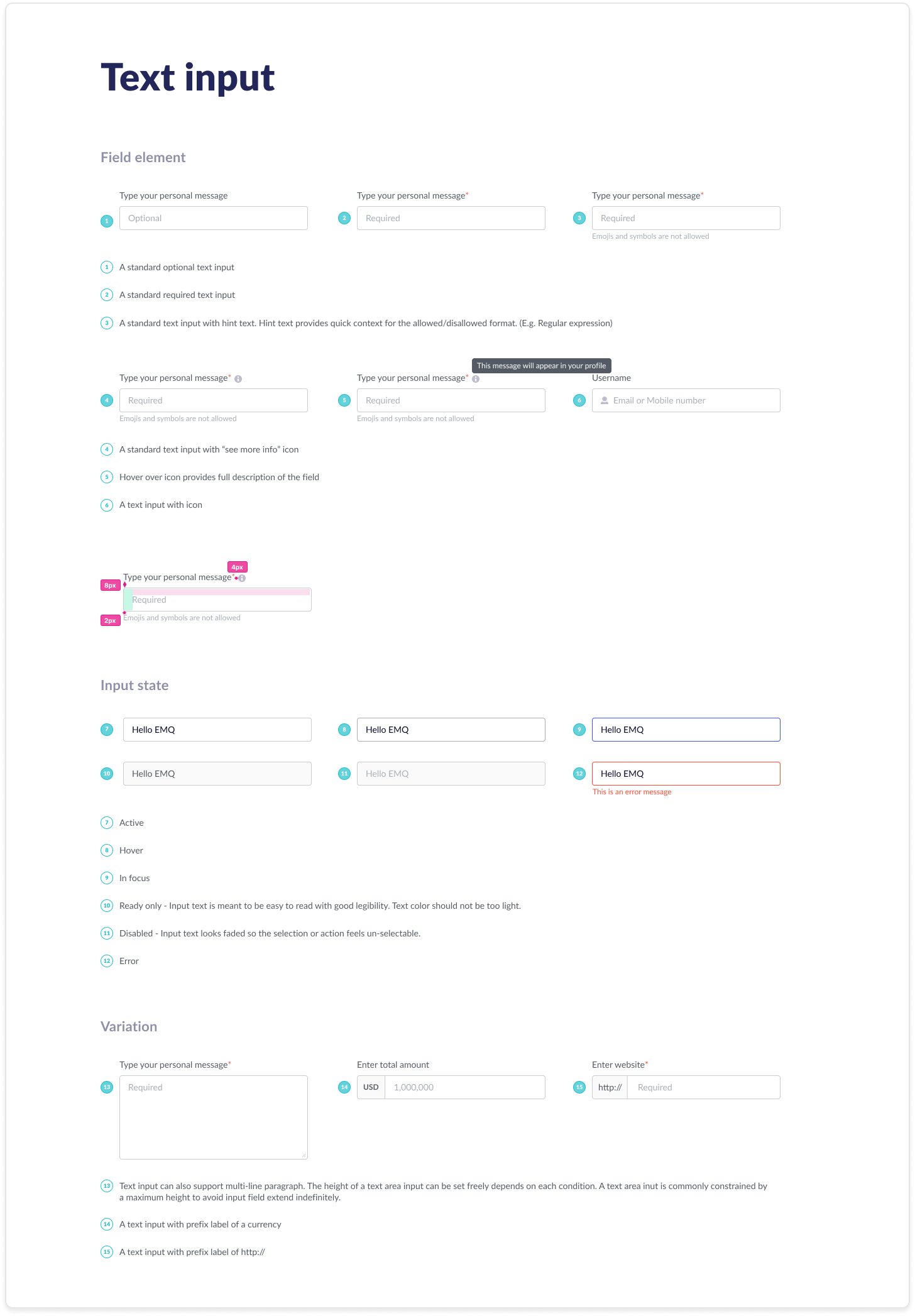
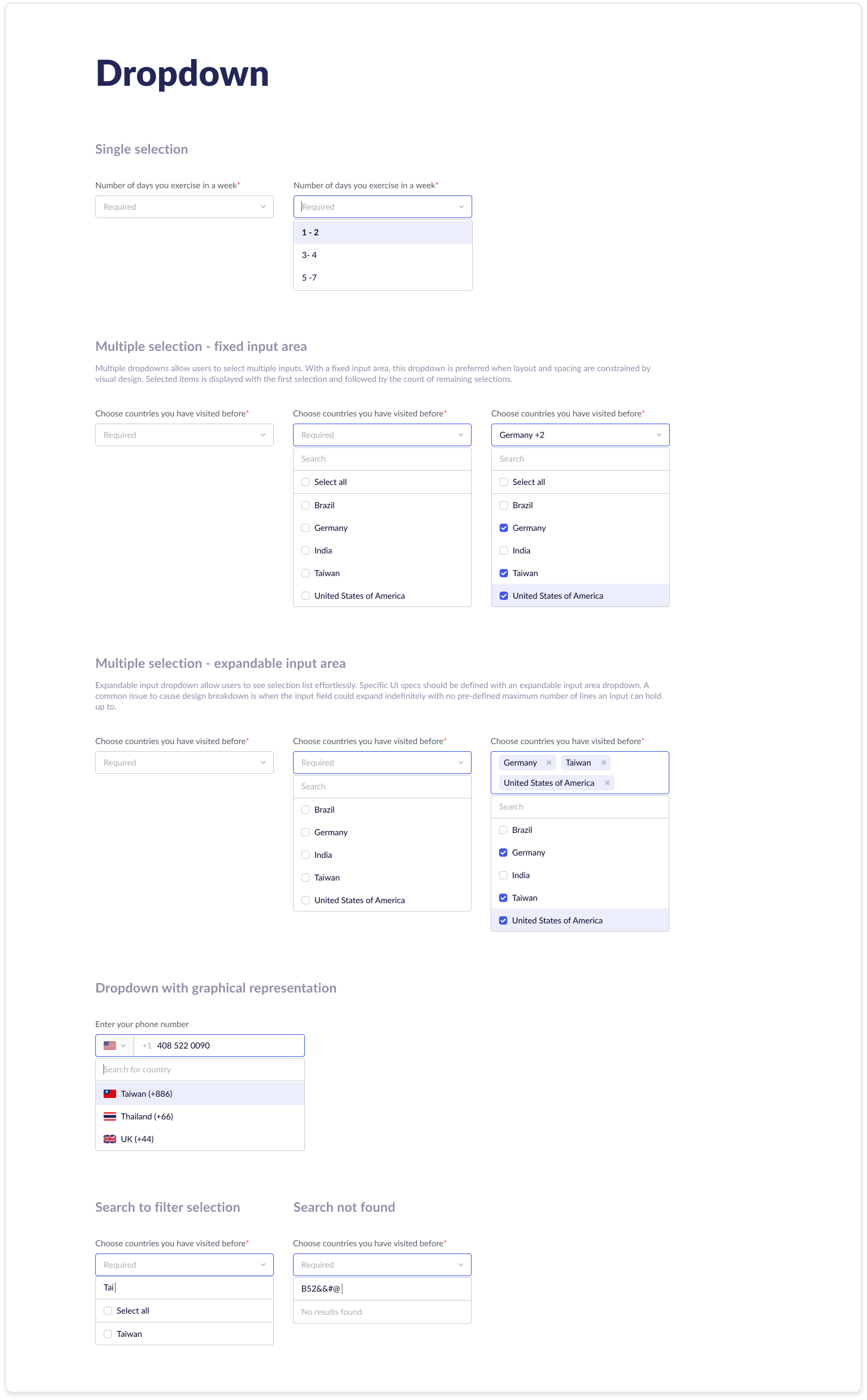
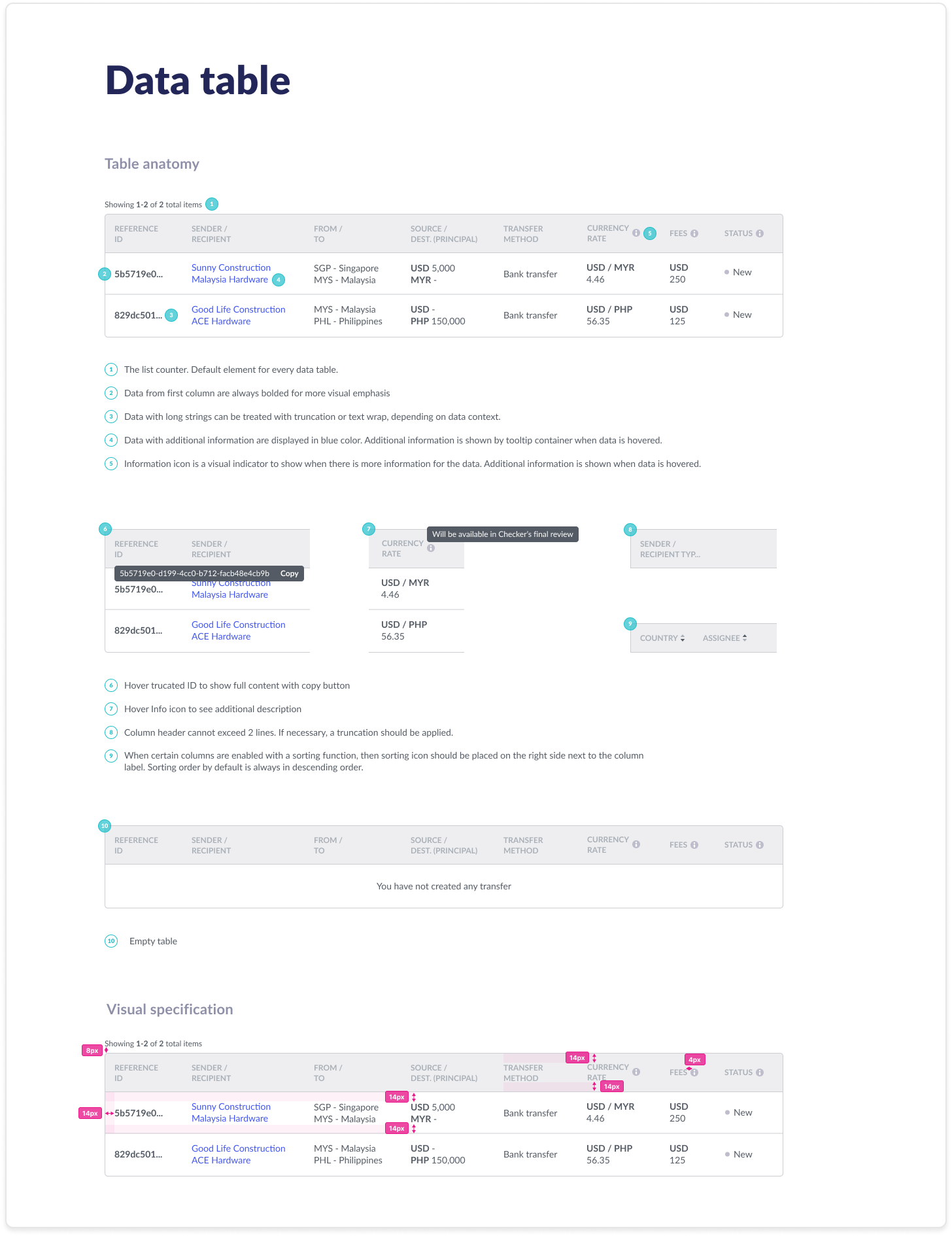
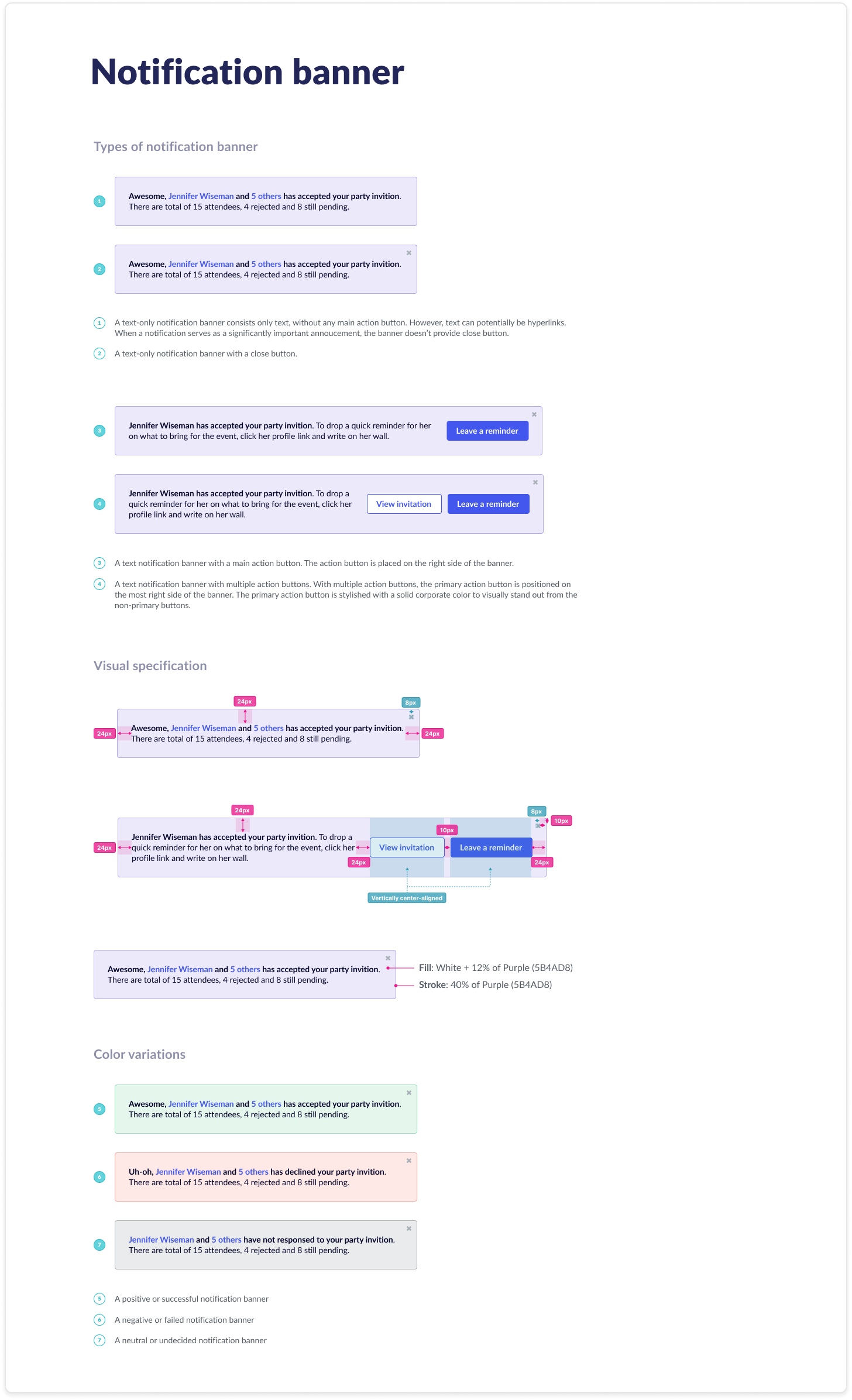
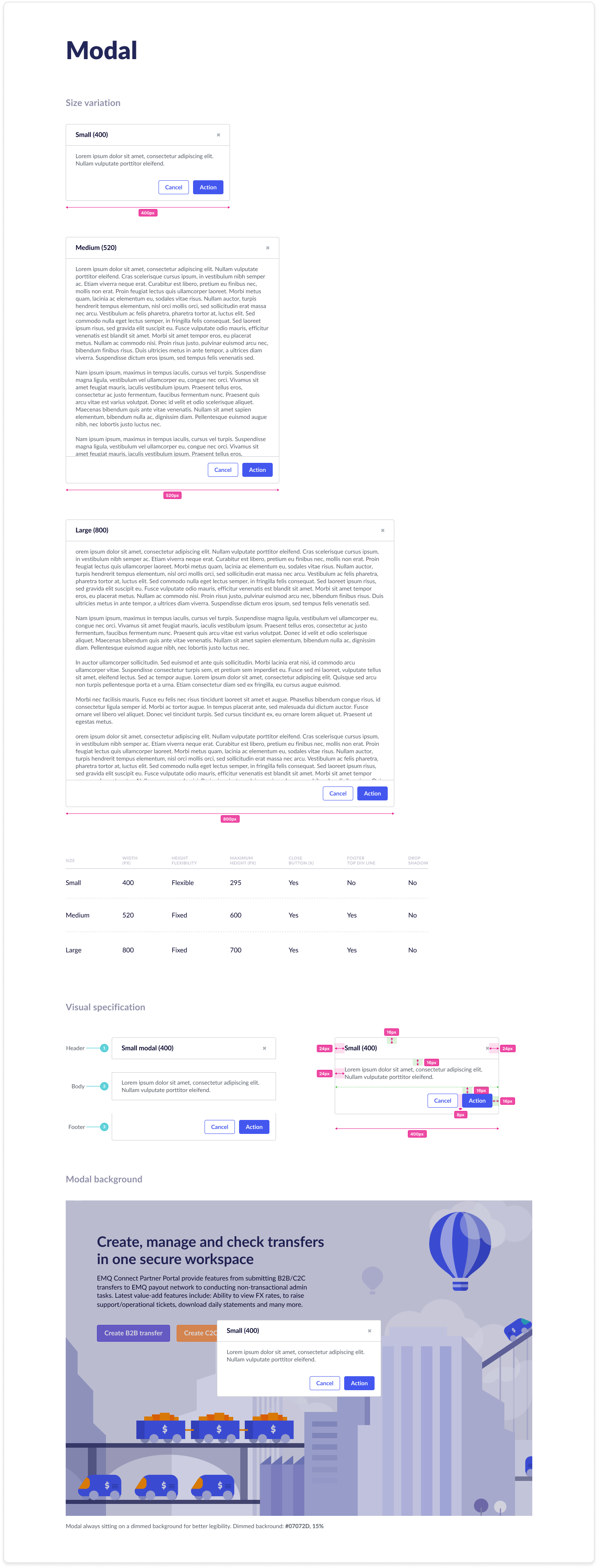
+ Component: Data table, modal, card, navigation, button, checkbox, dropdown, date picker...
+ Visualization (Work-in-progress): Bar, pie, stacked, box-plot chart...
Thank you for viewing!