The backstory
Citrix Secure Mail is an enterprise email client which lets users manage emails, calendars, contacts, and files in one single app and it is available for both iOS and Android phones and tablets. Secure Mail is built on top of Microsoft Exchange server but designed and implemented by Citrix mobile design team. It's the most used app (approximately 2 million active users) within Citrix mobile solution family and also the product I've focused on during the past two years.
Calendar with no Personal Calendar Overlay capability
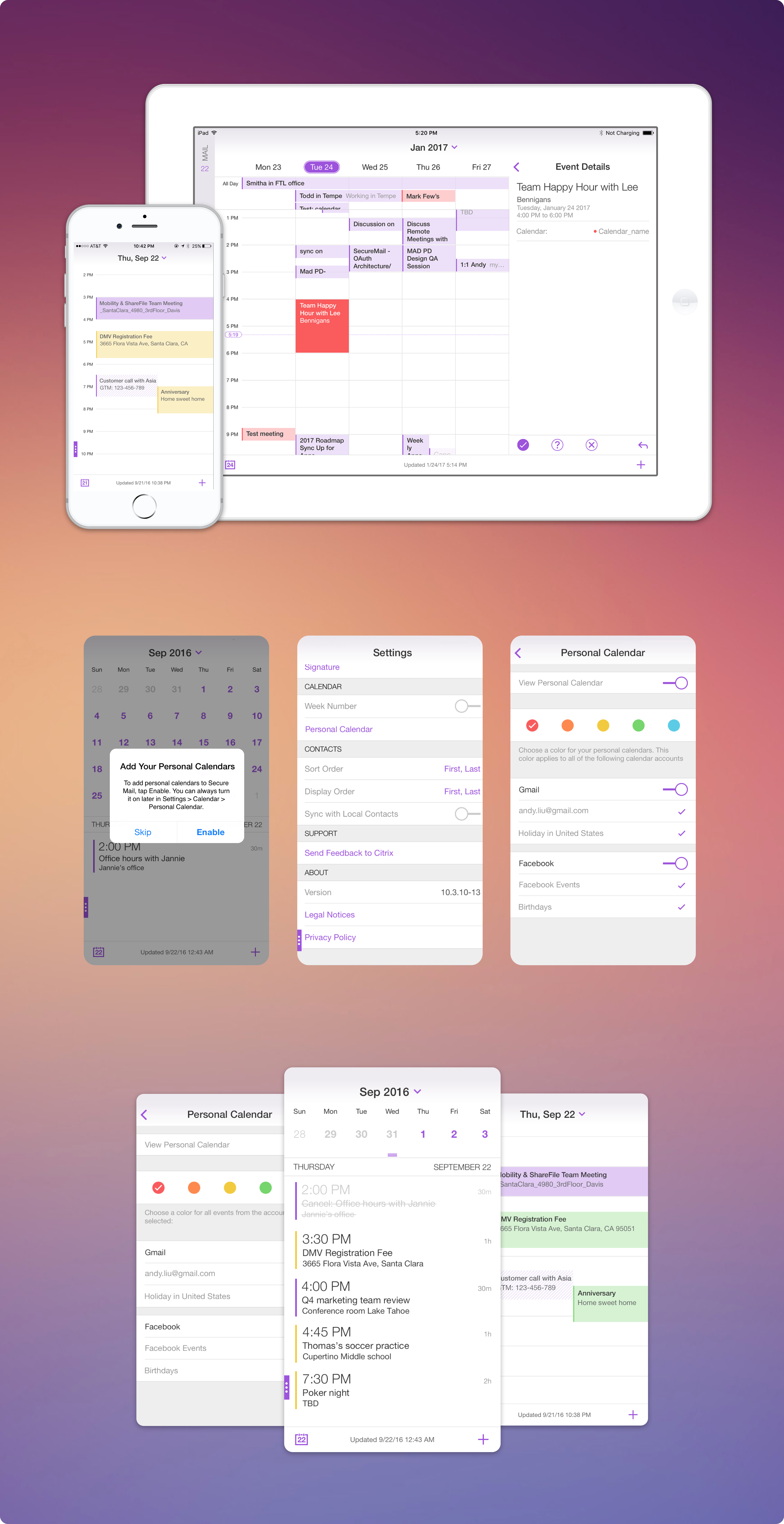
Before Personal Calendar Overlay feature, Secure Mail calendar allowed user to view their meeting invites and to accept or decline events from their mobile devices to always stay on top of their work meetings. As the concept of BYOD expanded significantly, more customers were hoping to see a calendar that can accommodate both work and personal events to avoid juggling between multiple apps. This was when Personal Calendar Overlay (PCO) feature was formally conceptualized.
PCO empowers Secure Mail users to sync calendar accounts from native calendar app and overlay these personal events in the calendar view. It was one of the most requested features from customer council and quickly became the top priority in Secure Mail roadmap.
Pre-design phase
The value proposition of this consolidated calendar view is to decluttering customers' day-to-day workflows and save them few clicks here and there. However, how much functionalities do we need when it comes to display these personal events in a work calendar? The business goal was clearly not to replace native iOS Calendar or Google Calendar but to provide enough information to help customers plan their days better around personal events.
To understand what users' expectations were, I worked with research team to conduct a series of user study with the existing customers to further learn their expectations. During the studies, we've learned that most customers were only interested in viewing their personal events, not so much on editing or sharing. This validation was valuable, as I was able to scope the project requirements from the early start and avoided unexpected changes down the wire.
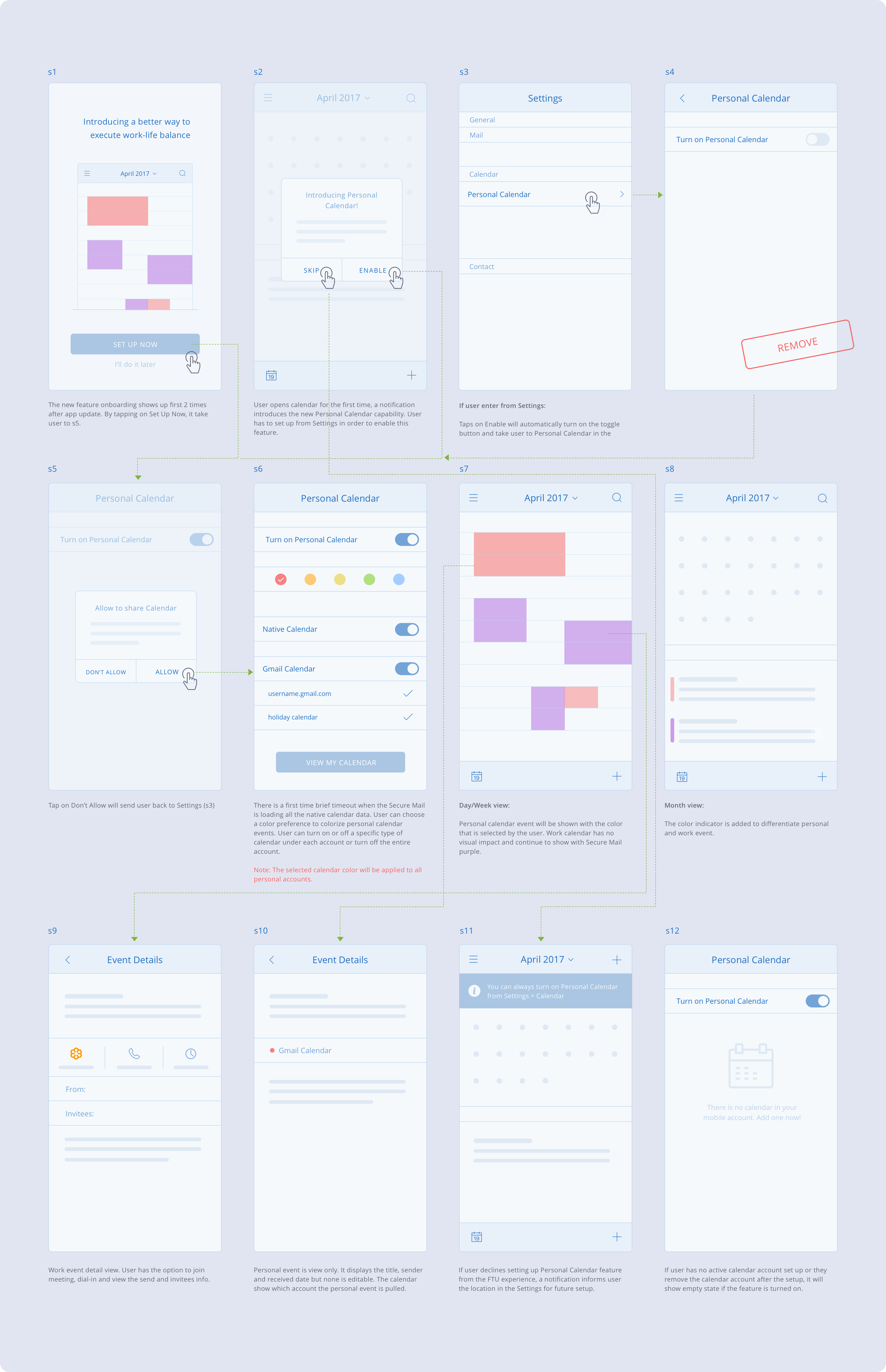
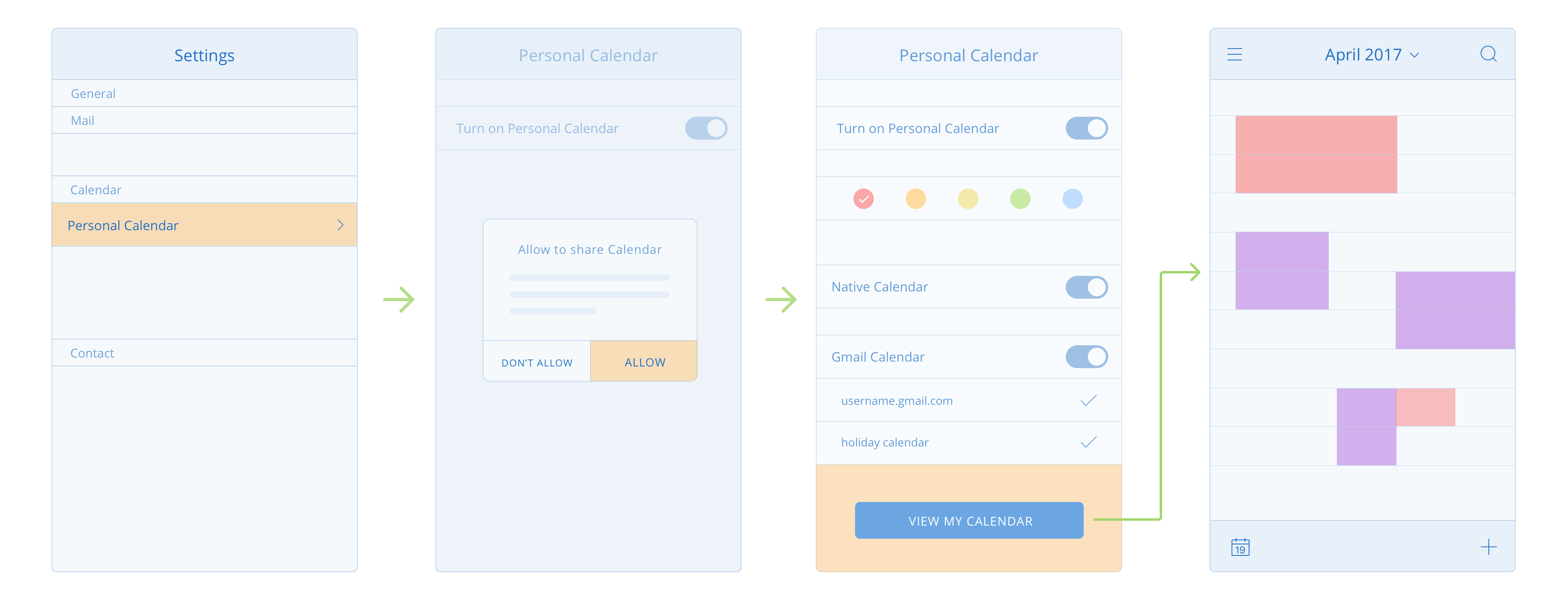
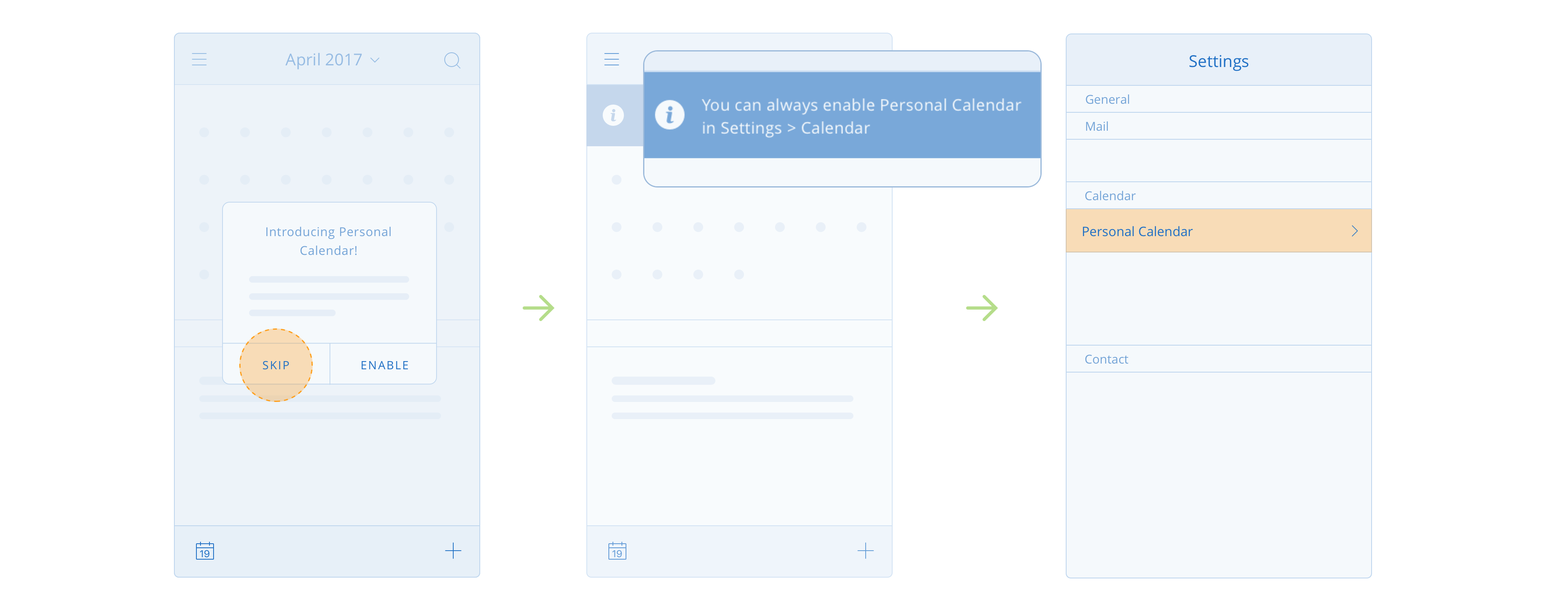
After solidifying the scope of the project, I spent majority of my time studying the existing pattern from the Settings and the impact the current Calendar would face with introducing the new feature. This was how the flow looked like:
The little things
Most users, including myself, generally do not like setup process, especially a tedious one. We appreciate a setup that is direct and requires minimum steps so we can quickly achieve our tasks and move on to something else. After my initial wireframe concept was finished, I went back to my design and hoped to streamline it even more.
One of the subtle improvements I made was, after the user completes the FTU setup, I added a button in the last screen of the setup (in the Settings) so as soon as user finishes the configuration, they can tap on the button to quickly navigate to their Calendar view and start viewing their personal events. This little subtle addition is easy to discover by the users and avoid them tapping on multiple back to get out of the Settings before they navigate their ways to Calendar.
Another small enhancement I focused on was the second time user setup assistance. To inform PCO capability, a dialog modal would appear as the first time the user fires up the Calendar. The dialog briefly introduces the new feature and anchors the users to the Settings so they can jump right into the setup process to enable PCO immediately. If the users decide not to engage the feature, they can dismiss the dialog but there will be a message acknowledging the PCO setup whereabouts so they can easily locate it from the Settings later.
These little things aren't critical to dictate the success of a feature, but they play a big role in making the experience feels much smoother and delightful. These are the little things I care.
Early visual concept
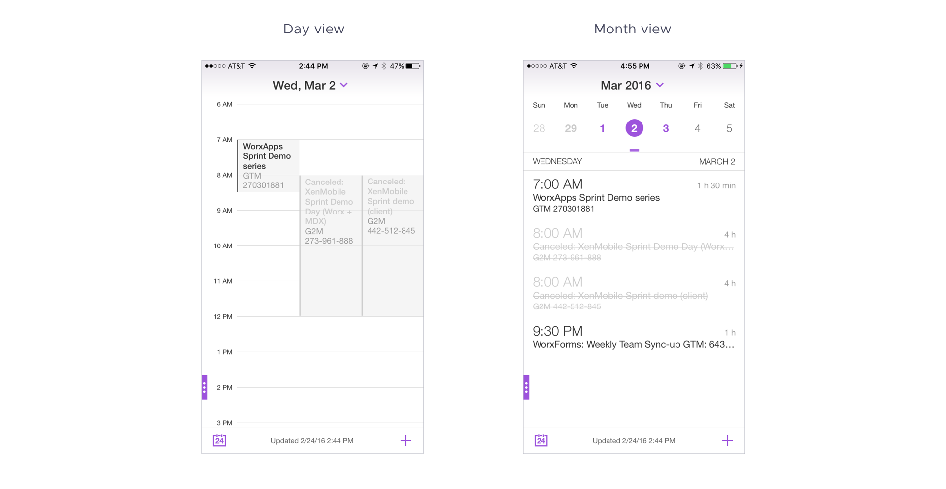
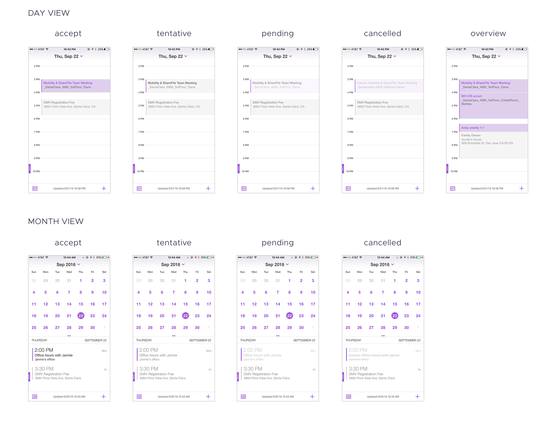
Prior Personal Calendar feature, work events were shown in light grey rectangles in Day/Week view and only text in Month view. In order to differentiate work and personal event, I initially reassigned work event color from grey to purple and grey for personal events. This visual treatment provided a distinct separation between the two but I later realized it also raised potential issues. The grey personal event were easily mistaken as a disable or pending event due to the light color value. I reiterated the design and defined a set of 5 color values. These preset color values provide users the options to customize personal event based on their preferences and also adds noticeable visual contrast between the two type of events.
Initial visual design
Personal Calendar Overlay color palette

The final design