What is Secure Hub?
Secure Hub is the agent that provides access to Citrix mobile apps such as Secure Mail, Secure Web, ShareFile and other SaaS apps. Customers download and install Secure Hub from the native app stores, and through a series of steps, they are guided to enroll their devices.
Device enrollment is the mechanism that enables first time authorization from a new device to Citrix mobile management management (MDM). Evidently, Secure Hub plays an essential role because it servers as the gateway that leads to app delivery. The overall experience needs to be friendly and intuitive so it onboards customers with ease.
Unfortunately, the existing experience wasn't quite as pleasant as it should be.
Friction points
I still recall the first time as I interacted Secure Hub onto my phone, questions such as "What the heck is a device enrollment" and "Why do I need a profile?" were raised instinctively during the onboarding experience. Although the purpose of Secure Hub was affirmative to me, jargons like Device enrollment and Profile installation were mentioned repeatedly without clear explanations made the experience disengaging and incomplete.
With user studies and in-depth UX audit, I concluded a list of pain points that hurt the user experience and needed to be improved:
1. Lack of explanations
Users are mandated to act upon with little or no instructions. For instance, users are instructed to install Profile or create password without given proper reasonings makes the actions feel forced and disjointed.
2. Missing progress indicator
During the onboarding, there is no indication informs the users with the total numbers of steps they need to take before completion. The lack of showing the current progress creates uncertainty and can frustrate users. It's like running a race without knowing where the finish line is, no one likes that.
3. Get rid of unwanted steps
The process contains too many unnecessary steps that don't serve practical values. To optimize and declutter purposeless actions will make the experience more seamless and effective.
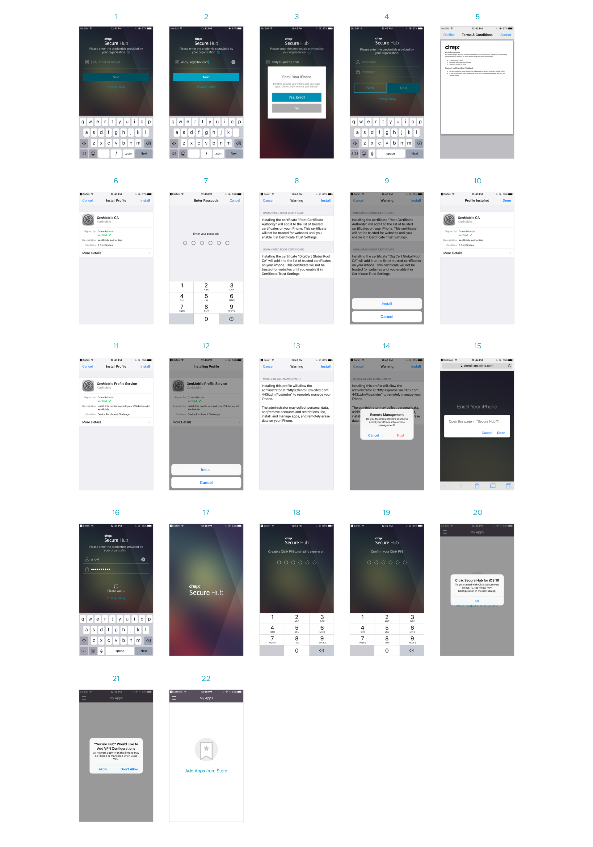
Existing onboarding flow
This 22 screens below demonstrate the standard flow of the existing onboarding that customers go through before apps delivery:
Key disengaging moments
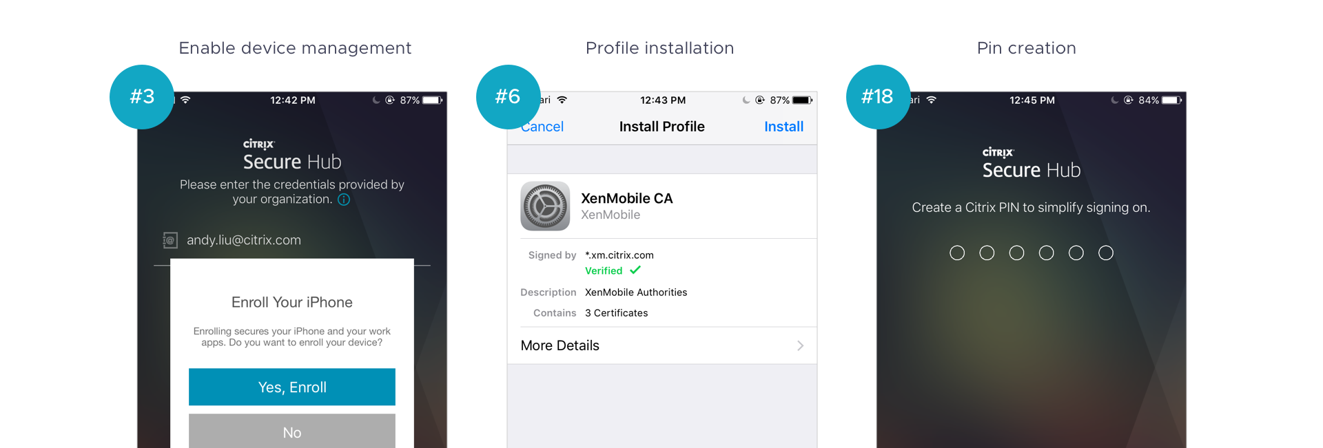
Screen #3 - when the user is presented with the options to either 1) enroll, which registers device with device management or 2) don't enroll, continue with unmanaged solution. The purpose of enrolling a device is not defined clearly to help the users to filter decisions.
Screen #6 through #14 - customers have to install two separate profiles (#6 & #11) which are mandated by Apple. Clumsy, tedious steps but inevitable procedures that need to be done before enabling device management.
Screen #18 - a screen where users are required to create custom passcodes for future authentication. It allows simpler verification by entering numeric pins instead of letters and special characters combination which is time consuming. The intention is great, but lack of advertising the benefit makes users under-appreciate its value.
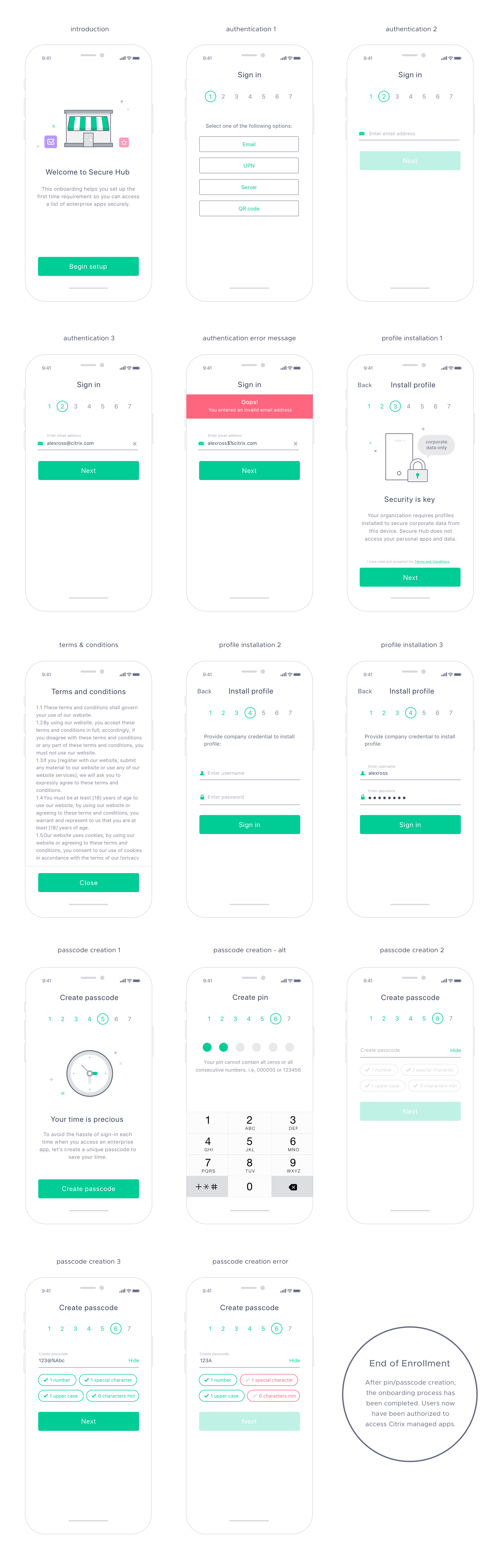
Initial wireframes
After identified the apparent friction points, I redesigned a few key screens by injecting the following design principles:
1. Provide contextual descriptions for transparency to help users mentally prepare upcoming steps.
2. Provide a clear progress indicator to convey total, current and remaining steps.
3. Insert assistive, delightful illustrations and replace big, tech terms with friendly English for better user engagement.

Redesigned the experience
After high level wireframes, I created a rapid Invision prototype and ran a series of internal usability testings with the research team. All 6 participants were Citrix employees from different departments with a combination of either have previous experiences with Secure Hub and first time users.
The objective of the study was to validate users' responses around the new progress indicator as well as how comfortable they reacted to the introductory screens that transition from the current task to the next. Since the redesigned effort was based on the concept of providing a more intuitive and comprehensible experience to users, we were excited to see that majority of the participants found the new, improved flow easier to follow and with less frustrations during the study.